// speed vs fuel
Economics of the fast lane
Driving faster trades fuel for time. Whether that is a good deal comes down to one number nobody can fill in for you: how much do you value your time? Give the calculator the price of your hour, pick your car, and it works out the cruising speed that costs least overall — and what every step up in speed is charging you per hour saved. The fuel curve underneath comes from steady-speed measurements of real cars.
Body type
Fuel
Your best cruising speed is around
——
Driving time
—
Fuel used
—
Fuel cost
—
Fuel use at that speed
—
—
| Speeding up | Time saved | Extra fuel | Per hour saved |
|---|
Highlighted rows are the steps worth taking at your price of an hour. That price does not change with distance — a longer trip only scales up the columns on the left. Faded rows reach past 130 km/h, where the data runs out and the model is extrapolating.
// how it works
Buying hours with litres
Fuel comes in litres, time comes in hours, and no chart turns one into the other. Draw both against speed on the same picture and the point where the lines cross tells you nothing at all — stretch one axis and it slides somewhere else.
There is one honest way out: decide what an hour is worth to you. With that number in hand, litres and hours are both money, and there is a single total left to make as small as possible. Nothing else on this page is yours to supply. Everything else follows.
Why the fuel curve has a bottom
Fuel use at a steady speed is three things stacked on top of each other:
- Overheads burn by the hour, not by the kilometre — air conditioning, electronics, the engine turning over against itself. The slower you go, the fewer kilometres there are to spread them across.
- Friction, mostly in the tyres, costs the same on every kilometre however fast you cover it.
- Drag grows with the square of speed. Of the three, it is the only one that gives you a reason to slow down.
The first and the last pull against each other, which is why the curve has a bottom — in every measurement behind this model it sits around 60 km/h. Above that, going faster always costs fuel and always saves time, and one question is left: is the trade worth it to you?
Why the answer is a range, not a number
The bottom of the total-cost curve is very nearly flat. A band some twenty km/h wide comes within one percent of the same total, so the difference between its two ends is a matter of small change. Anyone quoting a single number to the decimal place is being precise rather than accurate — which is why this page answers with a range.
The three pictures
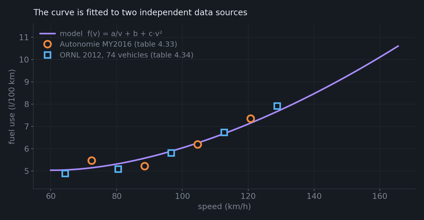
The data comes from two independent sources in Oak Ridge National Laboratory's Transportation Energy Data Book — Argonne's Autonomie simulation of MY2016 vehicles, and a dynamometer campaign on 74 real cars. Neither source knows about the other, and they land on the same line.
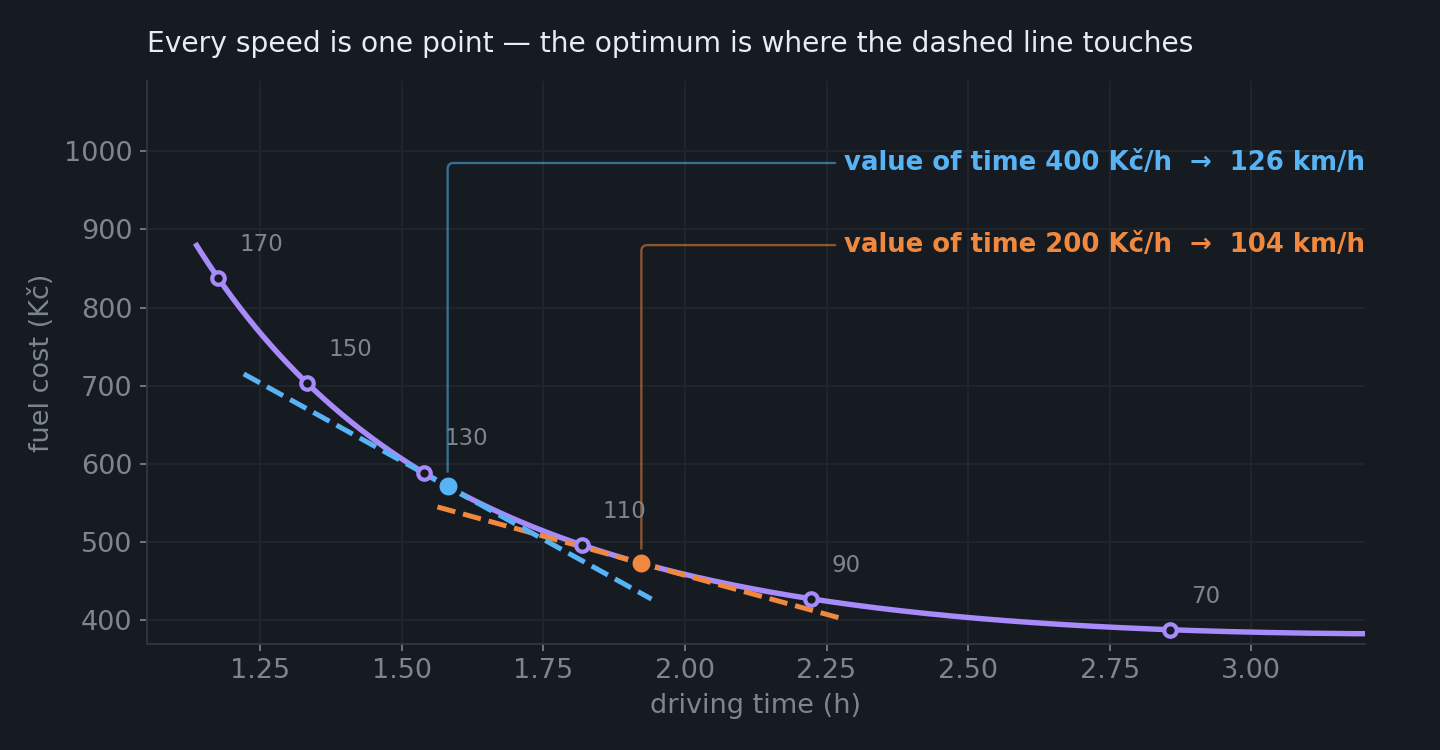
Both axes are outcomes rather than inputs. Every speed becomes a single point, and together they trace a falling curve. Your preference is a straight line whose slope is the price you put on an hour, and the optimum sits wherever it touches. Value your time more and the line tilts, sliding the touch point along the curve to a higher speed.
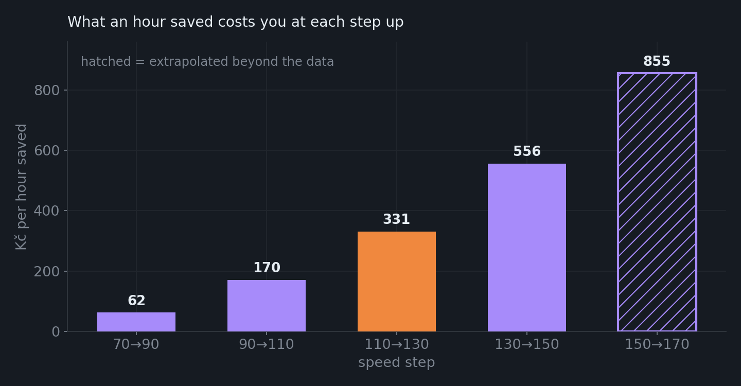
Each step up buys less time than the one before and burns more fuel, so the price of an hour climbs steeply. This is the number worth arguing with yourself about.
If you have done microeconomics, you have seen this before
It is a textbook constrained-optimisation problem in a driving licence. The middle chart is a transformation curve between two goods — money and time — and the whole calculation is the standard tangency condition.
| On this page | In the textbook |
|---|---|
| The falling curve of cost against time | A transformation curve. Its slope is the marginal rate of transformation — what an hour costs in fuel. |
| The price you put on an hour | The marginal rate of substitution. Hold it constant and money and time become perfect substitutes, so the indifference curves come out as straight lines. |
| The point where the line touches the curve | MRS = MRT — the classic tangency condition. |
| The price of an hour rising with every step | Diminishing marginal returns. Each extra 20 km/h buys less time and burns more fuel. |
| The optimum being a band rather than a number | The envelope theorem. At the optimum the first-order effect vanishes, so deviating only costs you at second order. |
| Driving to meet a fixed arrival time | The same problem with a binding constraint, whose shadow price is exactly the value of time that would have produced that speed on its own. |
Putting a price on time is not a new idea — it goes back to Becker's A Theory of the Allocation of Time (1965), and transport economists have built on it ever since. The value of travel time savings is what makes the cost-benefit case for most road and rail projects. This page just hands you the slider instead of choosing the number for you.
What the model does and doesn't know
The shape of the curve comes from ORNL TEDB ed. 40, tables 4.33 and 4.34. Four measurement
campaigns between 1973 and 2012 agree that fuel use bottoms out around
57–64 km/h, and the curve is anchored to that average. The level for each body
type comes from the median combined consumption of the matching class at Natural Resources
Canada (5019 petrol cars, MY2020+). Only the ratios between classes are used, never
the values themselves — North American figures do not transfer to Europe, and a
“large SUV” there is a Tahoe, not a Kodiaq. Enter your own consumption and that
estimate is replaced outright, which for anything off the mainstream is the only honest way
to use this page. Coupés and convertibles have no class of their own in the data, so their
medians are pulled from model names; the van figure rests on four vehicles and is the
weakest number here. Cargo and roof load are physics rather than data, and they
behave differently: cargo makes the trip dearer but leaves the recommended speed where it
was, because weight adds the same amount to every kilometre whatever your speed. A roof box
does lower it, because drag depends on speed. The data stops at
130 km/h — above that the drag term is only being extrapolated. The price of an hour is
good to roughly ±20 %, which comfortably settles the choice between 110 and 130. The whole model is a
simplification, and deliberately so. It is not trying to reproduce what actually happens on
a road — hills, wind, traffic and cold starts are not in it and were never meant to be. The
point is a different one: to take the idea that time has a price and see what follows from
it for the speed worth driving. Treat the number that comes out as something to think with
rather than an instruction — and certainly not as a licence to speed.